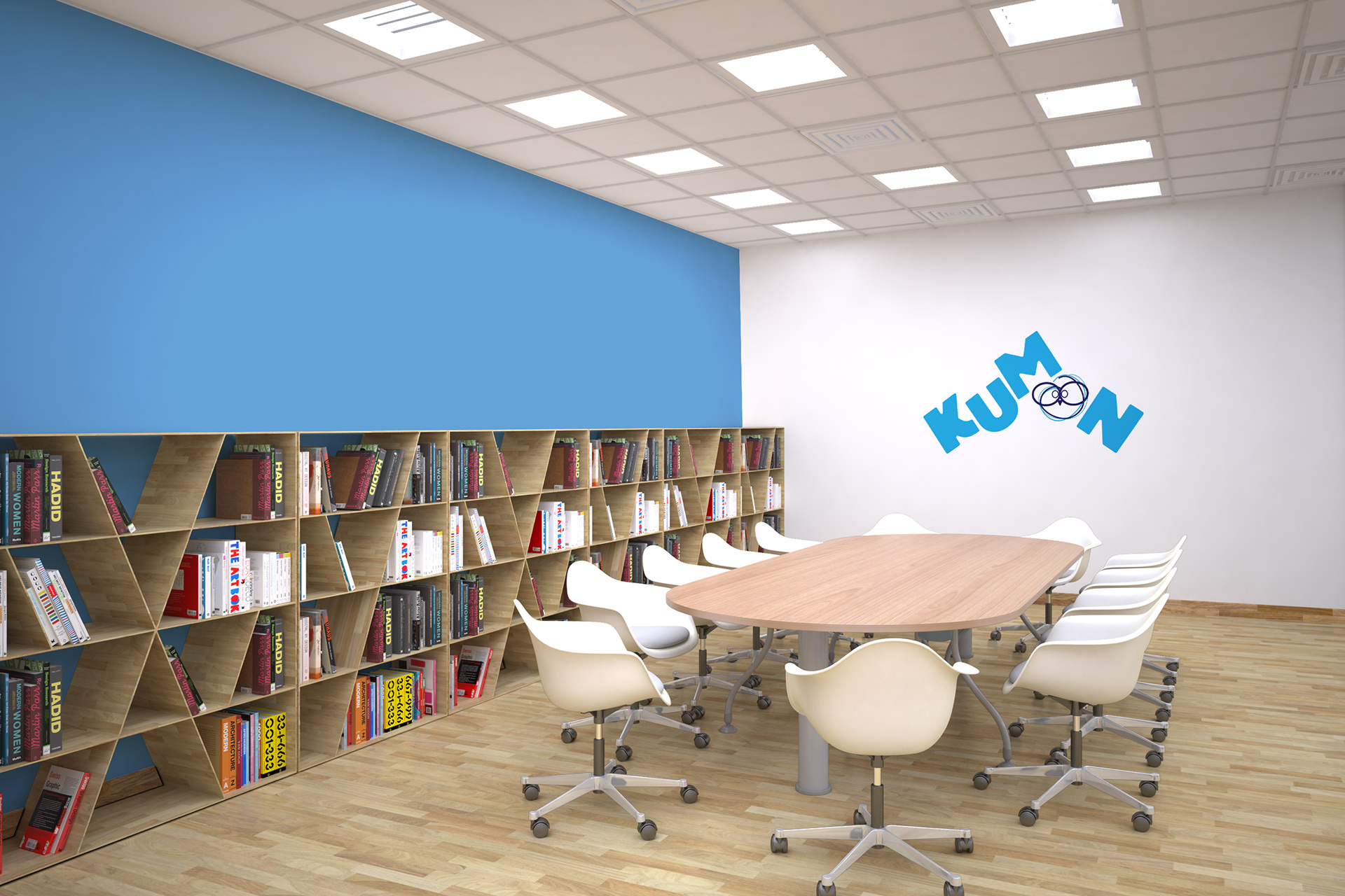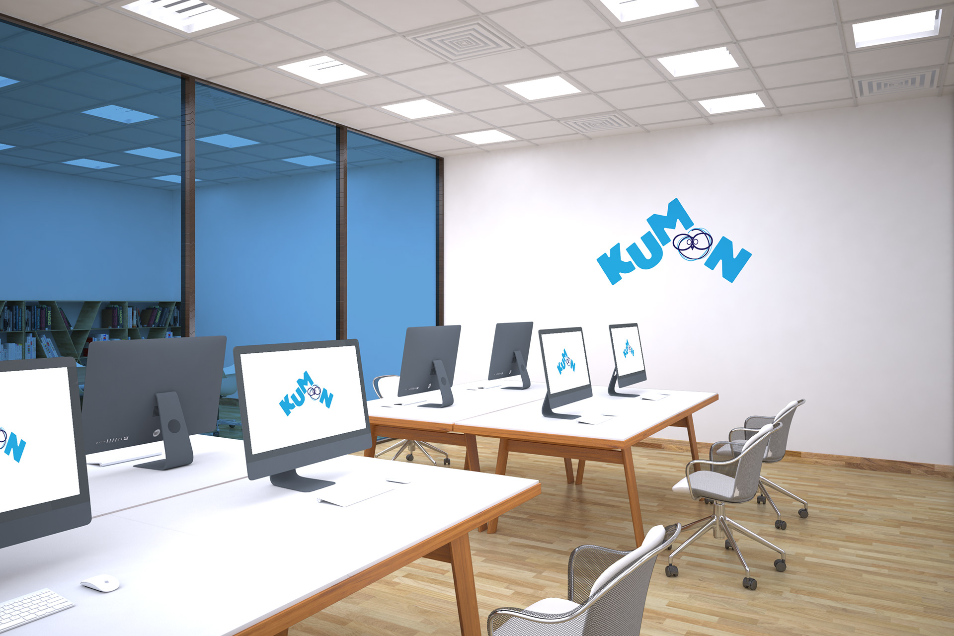
Kumon is an after-school learning center that helps children succeed in school and throughout their life. Children's parents and staff play different roles in this institution, being equally important to experience a happy journey. The challenge was to rebrand and create a new visual identity.
Problem:
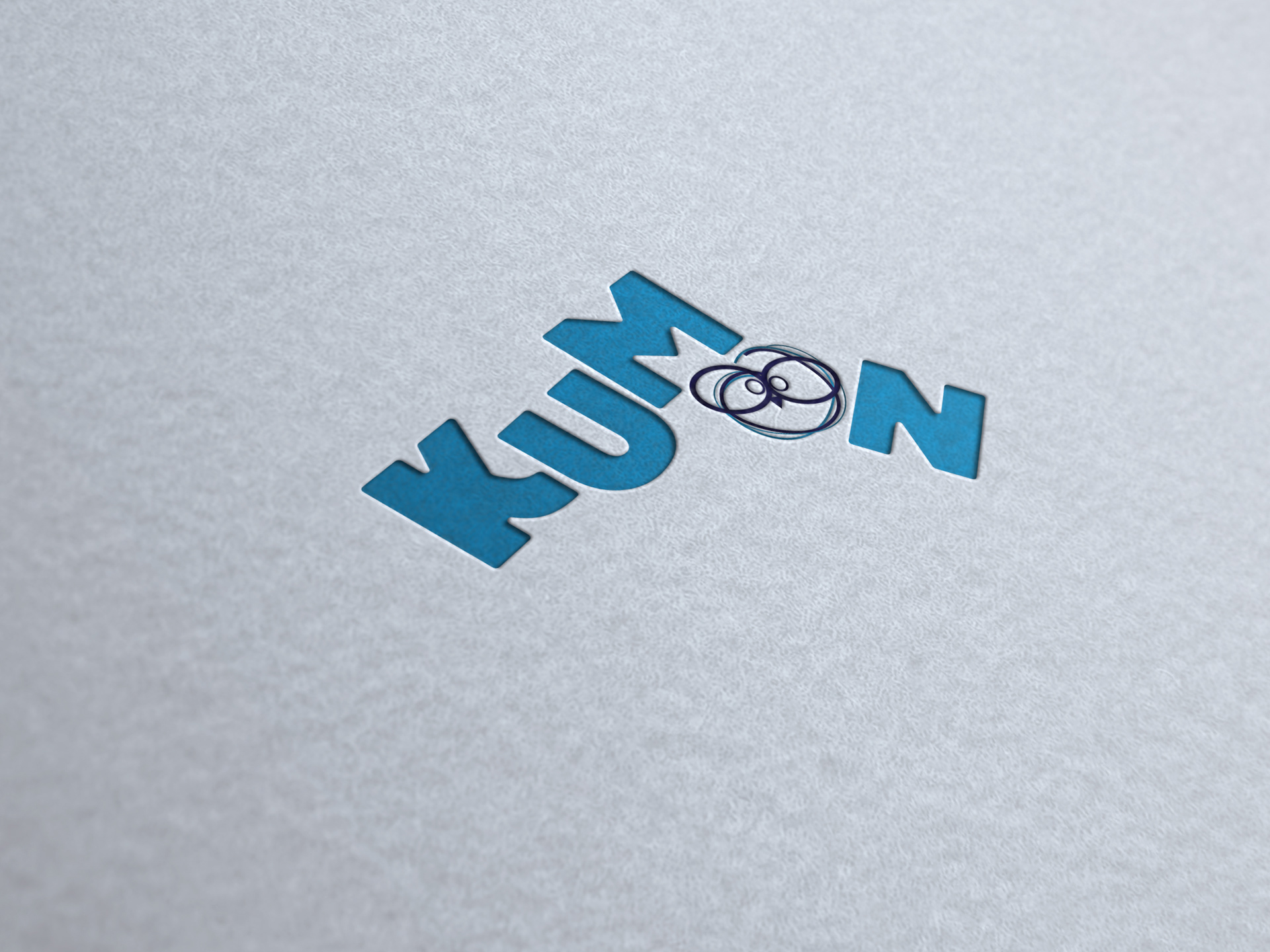
The KUMON word on the current logo has a horizontal shape with capital letters typeface and a face icon used as the letter “O”; the “thinking face” as the business refers to.
The problem is the actual logo is too serious, boring, and not attractive. It has a standard medium stroke typeface and an icon that does not communicate a thinking face to the target audience. It would be beneficial for the company to have a firmer idea to create an exciting experience for their clients.
Solution:
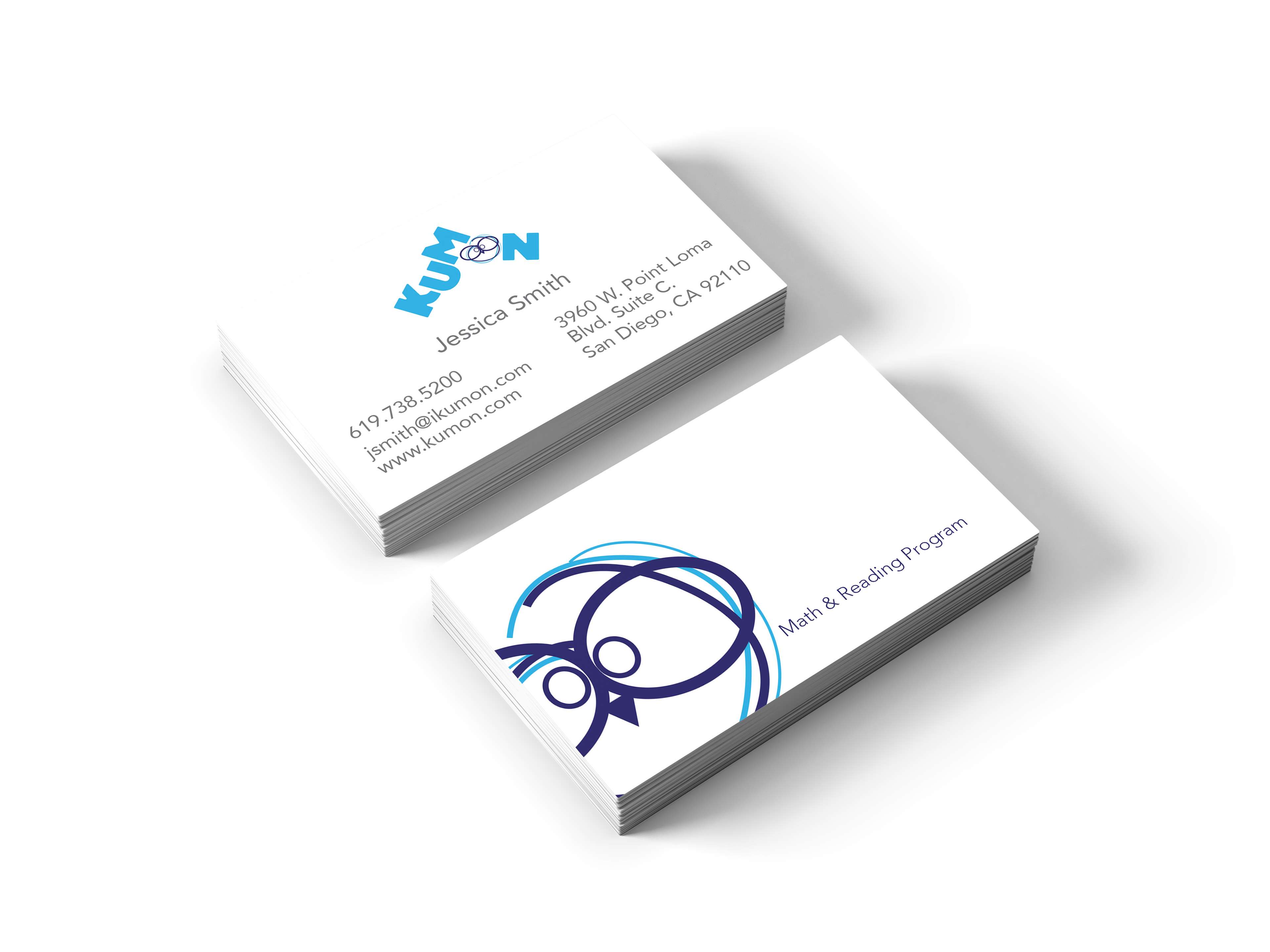
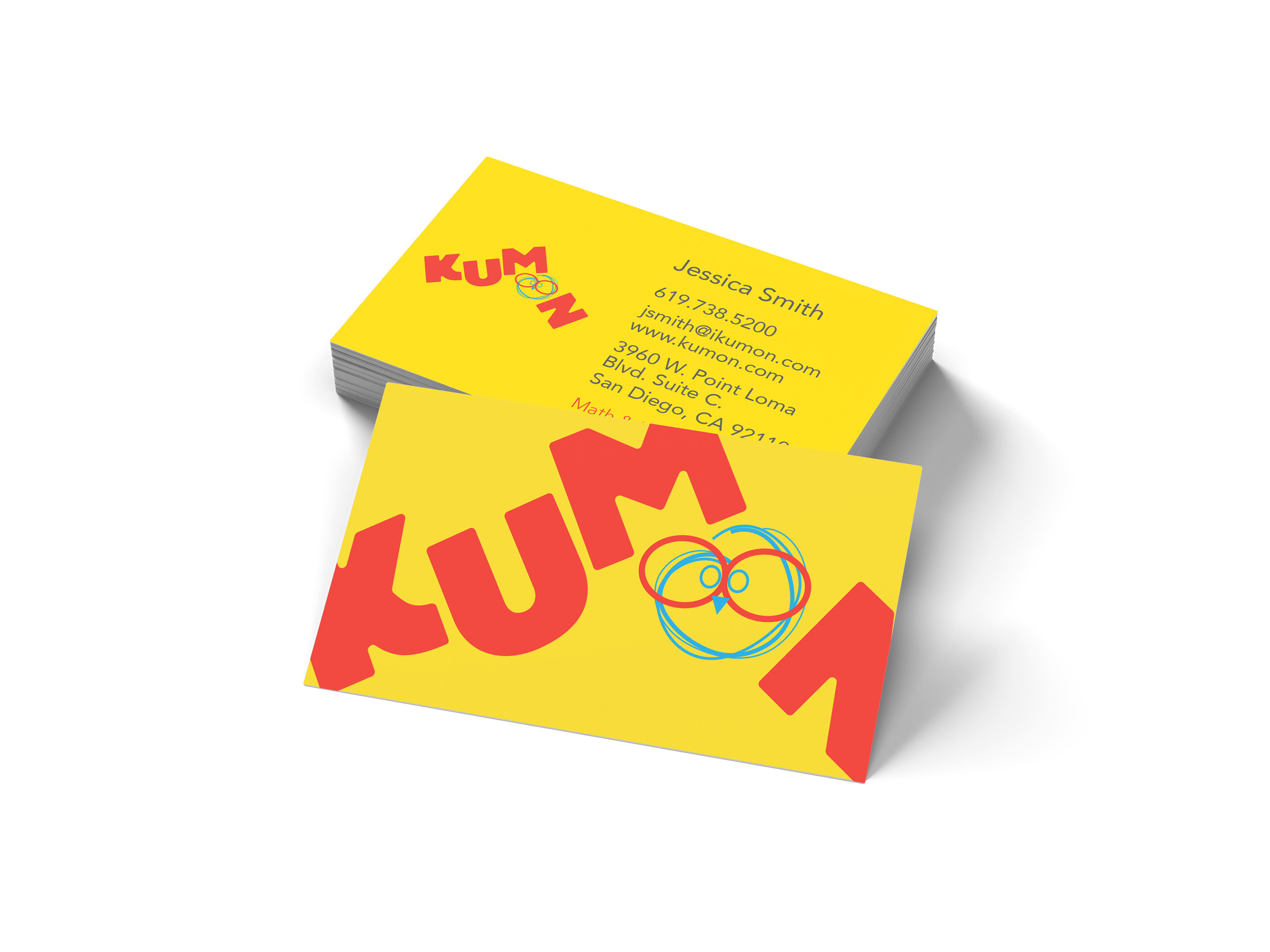
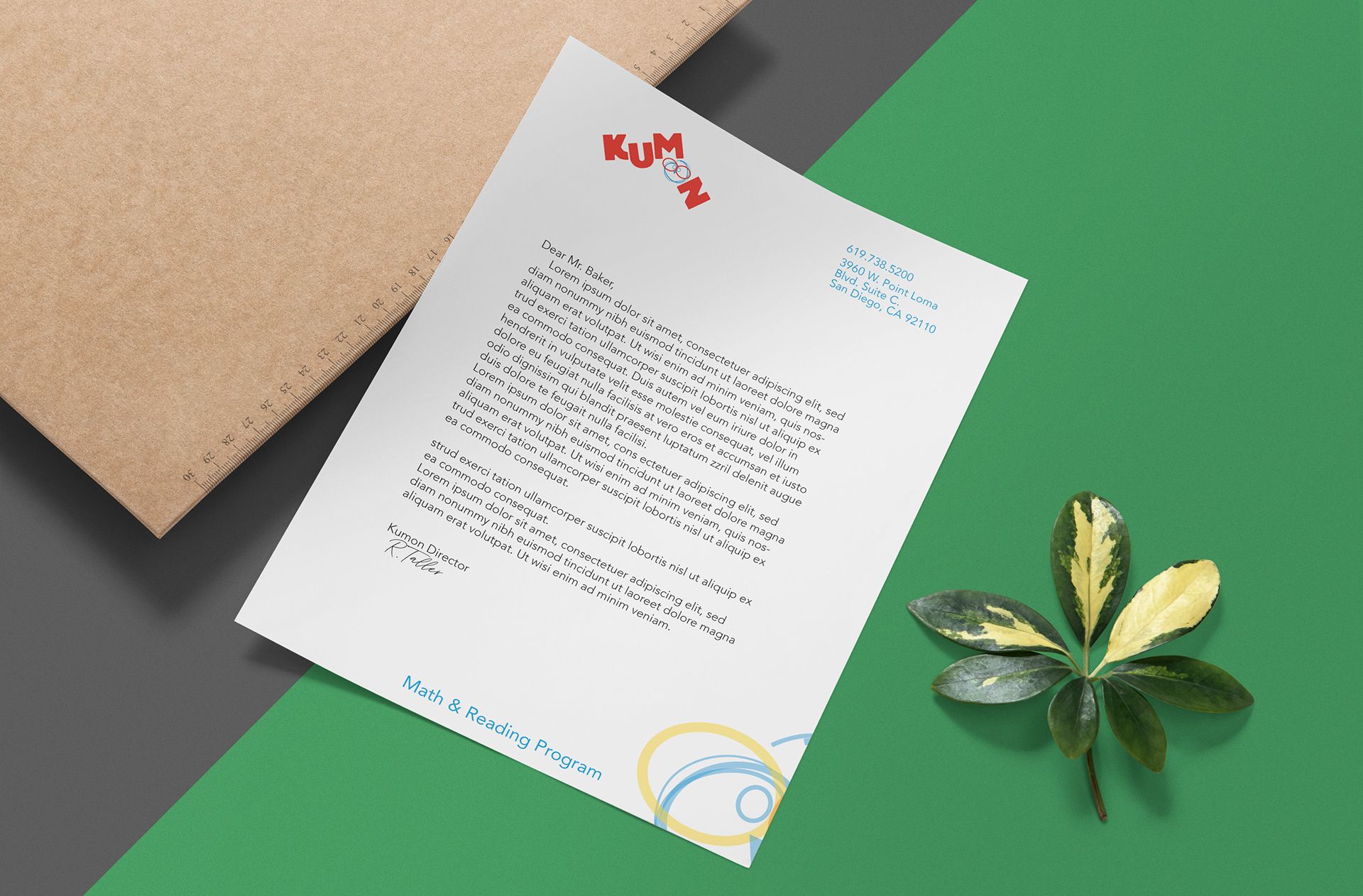
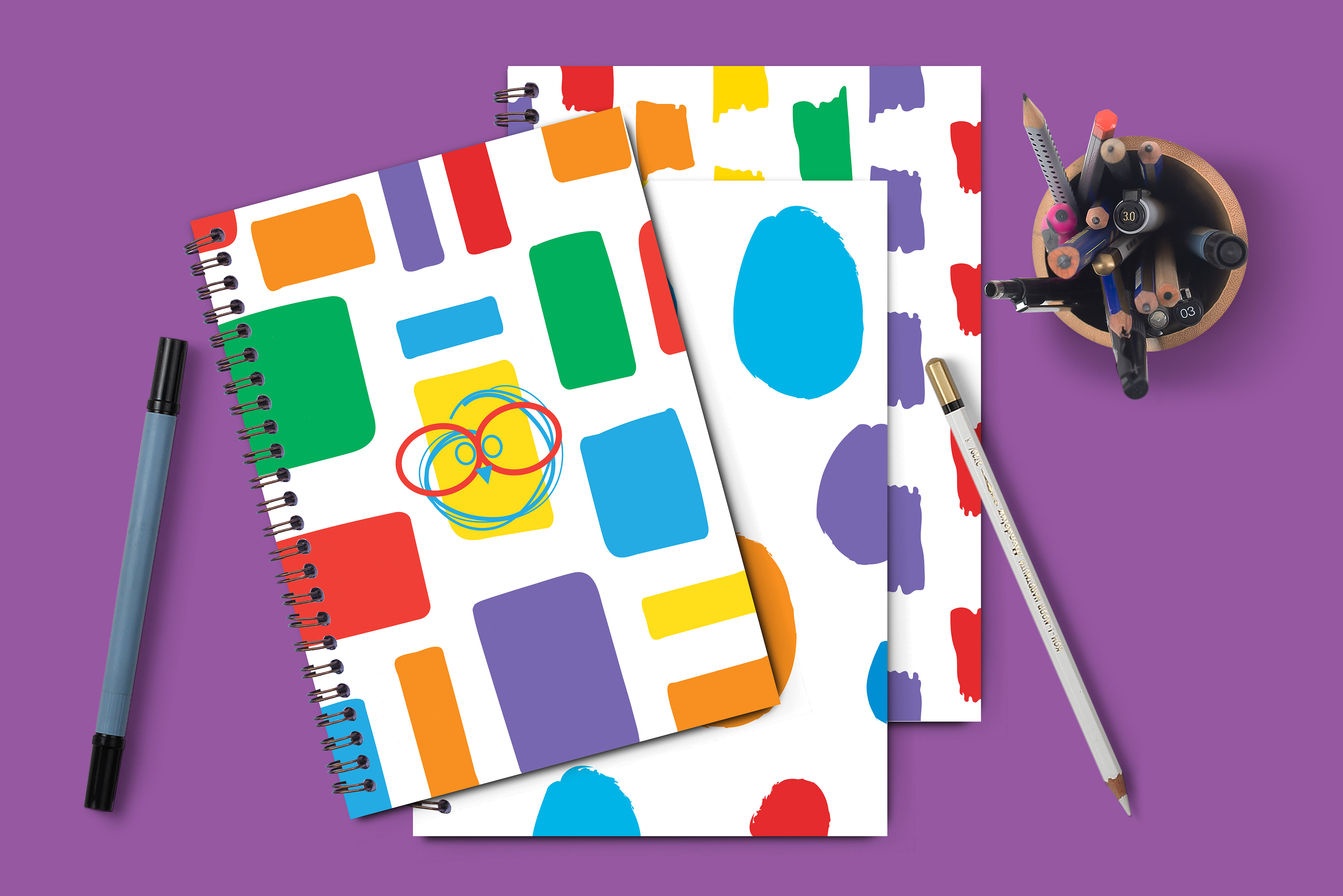
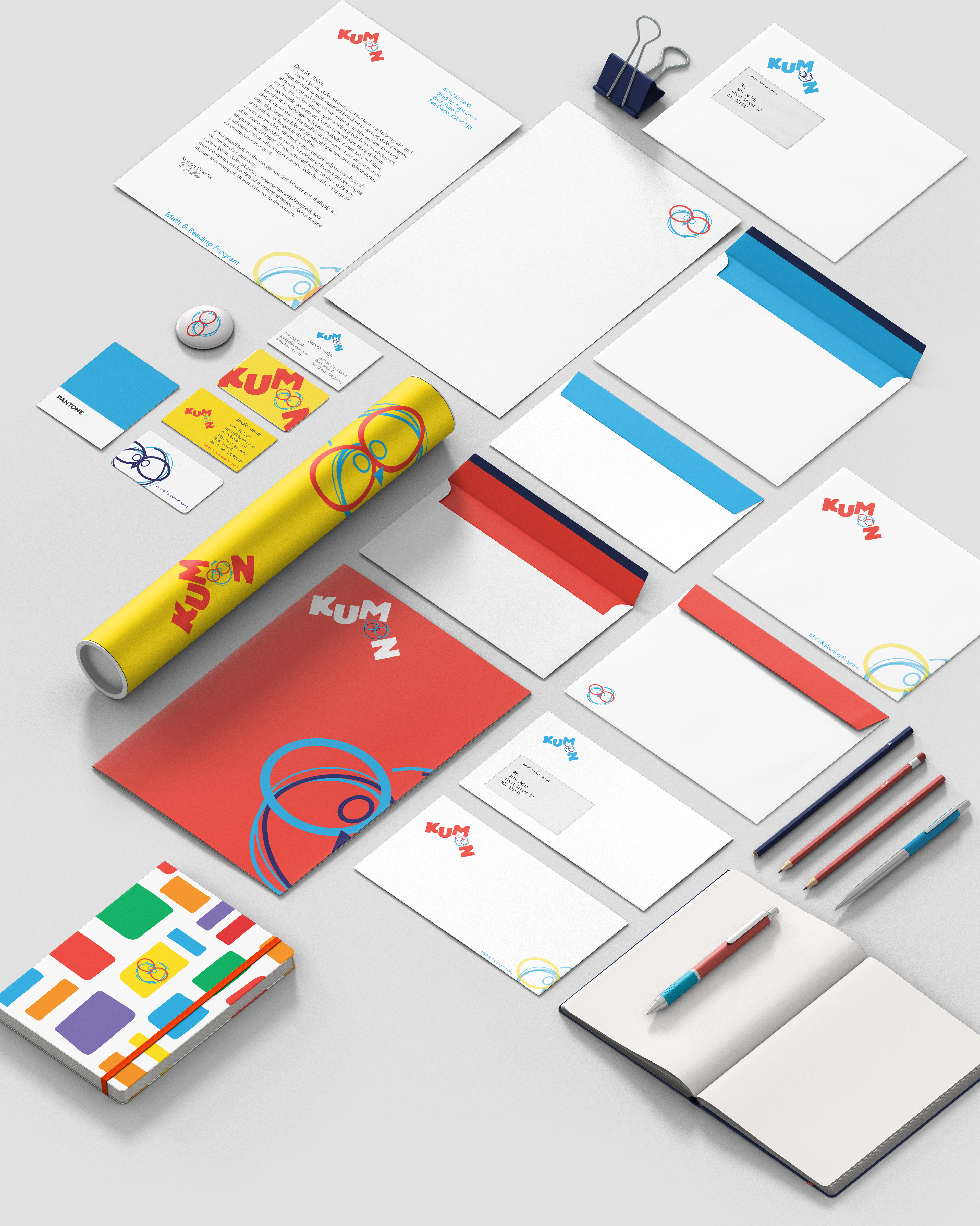
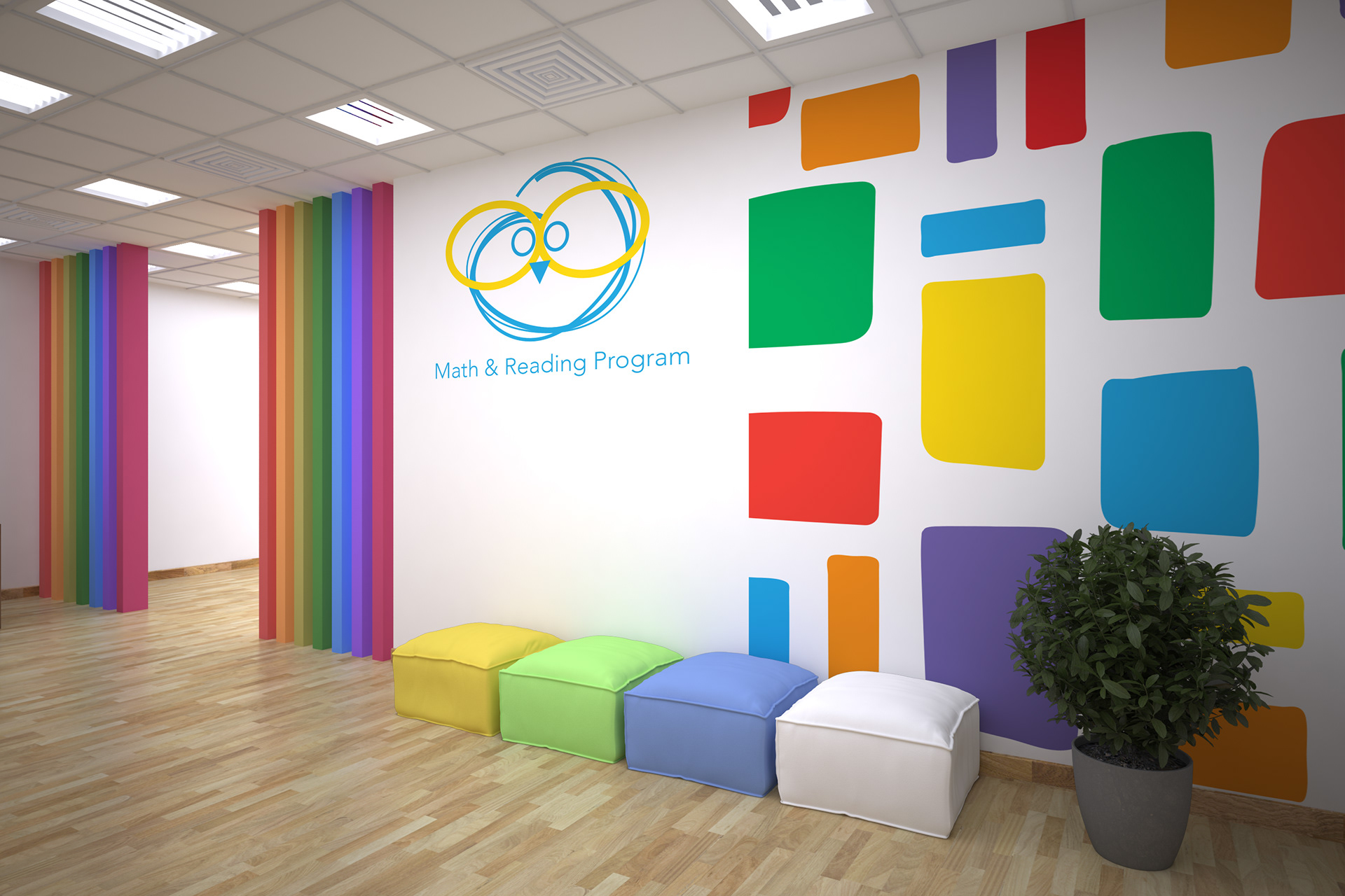
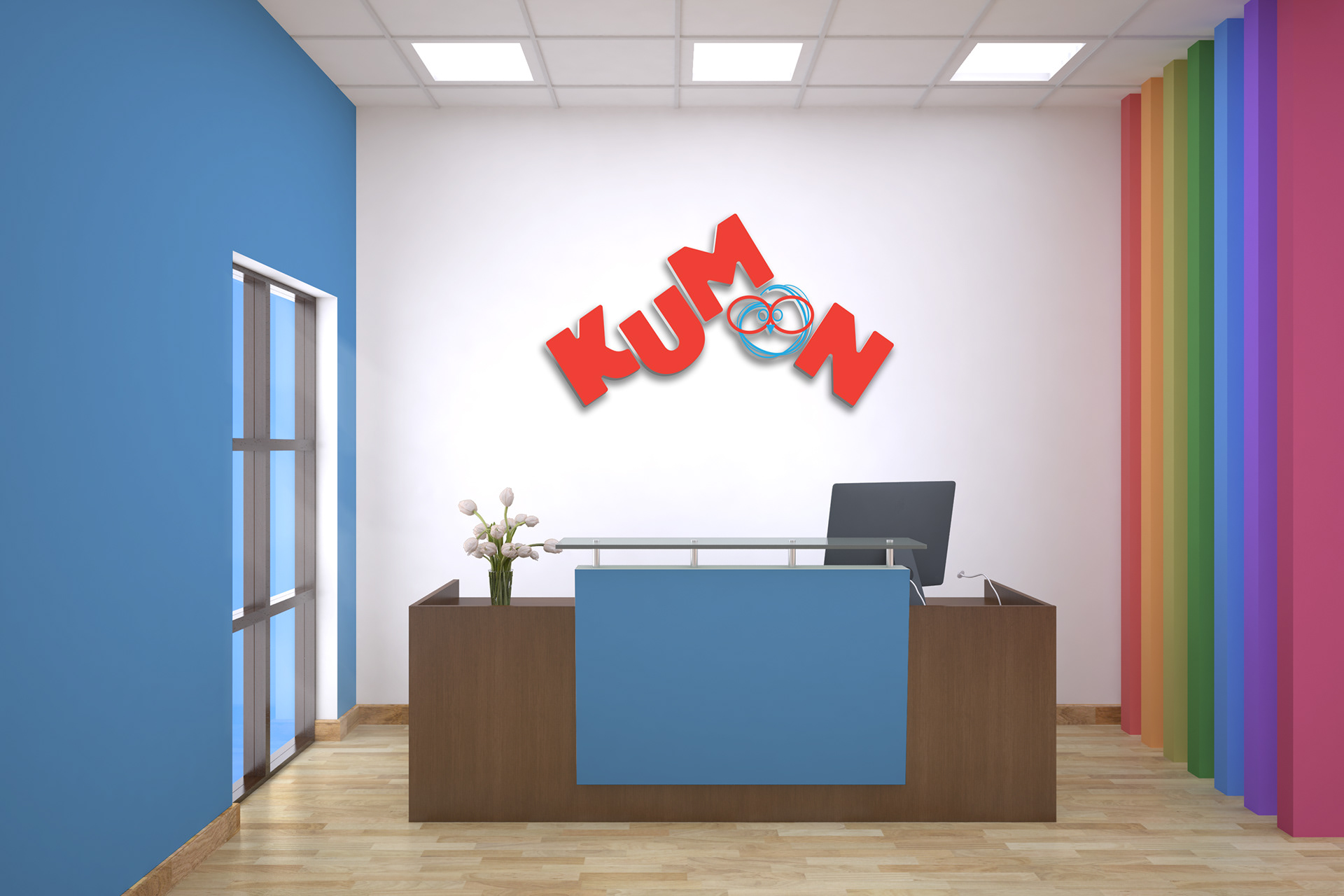
Refreshing the whole brand identity was challenging and engaging. Redesigning the brand with strategy can help the business, providing them an attractive, fun, and memorable image to the target audience. First, coming up with an icon representing a learning center for kids. This hand-drawn symbol is fun to see and communicates the learning environment message. Secondly, including the typeface playfully and dynamically to convey children’s development process and experience.
The purpose of choosing a primary color palette was to demonstrate a learning center environment. Still, a navy-blue value was added to the palette. Thus, the new logo is engaging, attractive, and harmonious, achieving an inviting atmosphere. The finished new logo describes the significance of the business for families, children, and staff.